Wednesday, 30 March 2011
Time Management- Progress Diary
We have completed making the teaser poster and the magazine front cover for our project. We have finished all areas of construction. The last section that needs to be done is the evaluation, were the whole project is evaluated.
Tuesday, 29 March 2011
Ancillary Task 2 - Magazine Front Cover
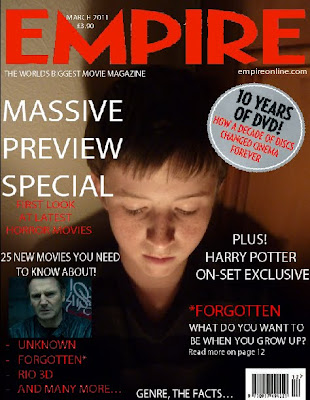
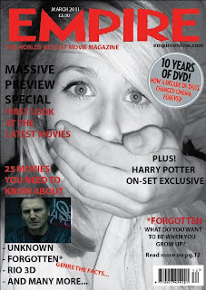
This is the Magazine front cover we have made for our film, we chose Empire to be the magazine we will use because it looks really proffessional and we thought it would suit the idea we had for our magazine. I used the layout Empire Magazine uses and the font it uses. I added the title massive preview special to hint at this magazine issue will be about teaser trailers and films that will be future releases. We used elements from the real magazine to make it more realistic.
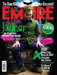
This is the magazine front cover that inspired our own magazine cover.
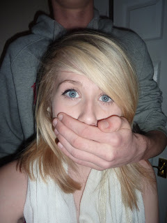
 This is the original image we started of with before manipulating it on Photoshop to use for the magazine front cover.

This is the magazine front cover that inspired our own magazine cover.

This is my second version of the magazine front cover.
 This is the original image we started of with before manipulating it on Photoshop to use for the magazine front cover.
Monday, 28 March 2011
Ancillary Task 1- Teaser Poster
This is the teaser poster we have created for our teaser trailer Forgotten. 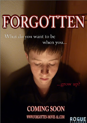 We have used the main character from our teaser trailer but we have used this character when he was younger. We have shown him looking down which hints to the audience that he is sad, we have also manipulated this photo using Adobe Photoshop to create a contrasted effect, and have his face covered in light but the background mainly darkness. We have made the title the main focus of the poster so it really stands out and closely underneath it we have included our tag line " What do you want to be when you... ...grow up?" We have also included the institution to make it more realistic and show the genre of the film, we then included the coming soon sign which many teaser posters use. We have then also included the website which people who want to see the film go on to create hype for the movie. We have a colour scheme for a teaser trailer and poster which is black and red, we have also used the same font we used for the teaser trailer to show a connection.
 We have used the main character from our teaser trailer but we have used this character when he was younger. We have shown him looking down which hints to the audience that he is sad, we have also manipulated this photo using Adobe Photoshop to create a contrasted effect, and have his face covered in light but the background mainly darkness. We have made the title the main focus of the poster so it really stands out and closely underneath it we have included our tag line " What do you want to be when you... ...grow up?" We have also included the institution to make it more realistic and show the genre of the film, we then included the coming soon sign which many teaser posters use. We have then also included the website which people who want to see the film go on to create hype for the movie. We have a colour scheme for a teaser trailer and poster which is black and red, we have also used the same font we used for the teaser trailer to show a connection.
Thursday, 24 March 2011
Poster Images
Here are a range of photos we have taken that we may use for our poster and magazine front cover. We took quite afew photos from different angles so we had more choice of what to use. We may use the image of the victim to hint at the horror genre or we may use the image of the boy when he was younger to show relevance to the story. 

Wednesday, 23 March 2011
Tuesday, 8 March 2011
Time Management- Progress Diary
We have finished filming all our scenes we would like to add to our teaser trailer and have started editing, we have also been practicing making posters using Adobe Photoshop and Adobe Illustrator. Editing will be quite a long process as we have many shots that need to be added and we have extra footage which is not needed.
Monday, 7 March 2011
Editing and Titles
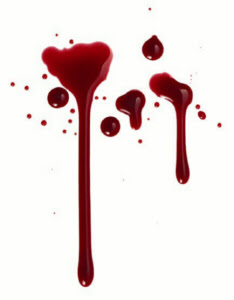
These are the titles we have created to use in our teaser trailer, we have chosen the theme red, black and white. The smaller titles will be intertitles that will build up to the main title, we have also included the title coming soon which many teaser trailers use, we have also included a made up website for our film.
Wednesday, 2 March 2011
Typical Audience Member
I have chosen a typical audience member who would watch our type of teaser trailer and would like to see more of the film. 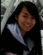 Name: Bonnie Age: 17 This is Bonnie, she would be a typical audience member for our film because she is in the age range of who we would expect to see our film which is 15-24, she is a female which would also make her one of the 60% that we would expect to see our film. She would most likely see this film with a group of friends.
 Name: Bonnie Age: 17 This is Bonnie, she would be a typical audience member for our film because she is in the age range of who we would expect to see our film which is 15-24, she is a female which would also make her one of the 60% that we would expect to see our film. She would most likely see this film with a group of friends.
List of shots still need to film
We have created a list of shots of what we still need to film, we will be doing the rest of our filming this weekend.
List of shots-
List of shots-
- More running shots, we need some more shots of the victims running, this will add a faster pace to our teaser trailer, at the moment we have still shots of objects and this creates a slower effect
- Killer standing looking at a house with a knife covered in blood
- Shots from higher angles looking down on people running
- Long dark corridors
- Focusing on a range of weapons
- Hands covered in blood being wiped on walls and doors
- Cleaning a bloody knife
- A body laying in a dark room
- Silouhette of people, bodies and running etc
- Signs like Your'e Dead
- Someone being dragged
- Someone hiding behind a wall catching there breath
- Someone at home making a drink and the killer looking through the window
- Someone cowering in a corner
- A hand opening a door
- Please die slowly sign
- Someone being grabbed quickly
- Legs running
- Dripping taps
- Flashing lights
- Someone screaming
- Doors swinging open
- People looking scared
- Hiding under a bed and seeing the killers feet
- Crawling covered in blood
- Crossing faces out (The image wall)
- Falling over outside because rushing and scared
- Dropping an object
These are all shots that will make our teaser more effective. When these are edited together quickly it will be more effective than if they were together slow.
Subscribe to:
Comments (Atom)


