
Tuesday, 5 April 2011

Evaluation 4: How did you use new media technologies in the construction and research, planning and evaluation stages?

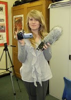
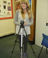
We used many different technologies and software in the making of our teaser trailer and ancillary texts, while making the products I learnt new techniques and ways of creating them. To film the teaser trailer we used a standard video camera, an adjustable tripod and a sound boom.


Equipment for filming:


Camera: We used a standard video camera to film our project, we were given a tape and could use the camera as many times as we wanted to film our footage, as there are quite alot of students doing media students some times when we wished to use them they would already be taken and used for the other groups. From using the camera I have learnt that sometimes the footage you film wont turn out the way you expected it, maybe due to lighting in the room or where you are filming it, for example some of our scenes were filmed outside at night so we used a cars headlights to create light so we could see in front of us. I have also learnt how still we need to hold the camera when filming longer shots, we found that quite alot of our shots were abit shaky where we didnt have a steady hand, the slightest movement shows up much more when on the computer screen and not on the video camera. Another thing I learnt was that the zoom on the camera sometimes goes out of focus so we tried avoiding the zoom completely. I found that the cameras we used are good for what we wanted to film.


Tripod: We used the tripod to help aid us in filming our teaser trailer, we mainly used the tripod to hold a shot steady. The tripod we used can extend and be made smaller so you can use it at a height that you need, where the camera attaches to the tripod you can also move it up and down and left and right and adjust how loose you want it to move, this helps create a smooth panning shot. From using the tripod I have learnt how to create different shots from different heights but the camera being still. I have also learnt that we should check all the equipment before we take it to use it for filming because the tripods have clips that can be removed these are what attach the camera to the tripod and some of the clips were not on the tripods when we took it home so we struggled to use the tripod when this happened.


Sound Boom: The sound boom is used to improve the sound while filming, in filming our teaser we found that we didnt need to use the sound boom as much because we had minimal sound from the footage we filmed, from using the sound boom we learnt that you have to remember to turn the sound boom on when you start filming or you will have no sound at all. Sometimes we only found out that we had no sound for our footage when we got back to school so we had to film the same footage again another time. We also learnt that the sound boom doesnt stretch very far so we would have to film the sound quite close to the camera. Another thing we learnt was that if you are too close to the sound boom and are quite loud the sound can crackle abit.


Editing equipment and research:


Computer: We found that the computer we used for editing the footage on was quite slow, there are only a couple of computers in the school that have the software we need on them, sometimes the computers in a different room were available and these were quicker so we would use this to edit the footage. The computer was the main element for planning and researching the whole product, we used it for editing, research on the internet and using different software to plan the products. We learnt how to use different softwares and new ways to record our work.


Adobe Premiere Elements: This is the software we used to edit the whole project. Using this software we can create many different effects. From using this software we found that sometimes when trying to edit the footage it can jump where the computers are slow, this can be quite frustrating and slows us down when trying to edit. We found that different transistions can create different effects depending on the style of your teaser, a horror teaser looks good using the dip to black transition where a chick flick may not. I also learnt quick ways of editing and cutting scenes. Another thing we learnt was that you can manipulate sound more and add many different effects and layer them to create a unique sound effect.


YouTube: We used YouTube to upload our videos we created to get feedback from other people and easily access the videos to add them to our blogs, from using YouTube we learnt that you can compare your teaser to other peoples teaser much easier and get more ideas about other peoples products. We also learnt that uploading videos can be a lengthy process. Uploading our audience feedback took abou an hour to upload.


Blogger: We used blogger to write up all our research, planning and evaluation for our product. From using blogger I learnt that the interent can not always be reliable, when I tried to access blogger from school sometimes it would not work and I would struggle to get work completed. I also learnt that it is an effective way of doing work as i could easily access it at home and continue work from where I left off. The last thing I learnt was that blogger can be quite slow at showing images I have posted, depending on what computers I used at school.


Slide Share: We used slideshare to create power points to present our ideas and drawings for what we would like to film.


Freeplaymusic: We used freeplaymusic to search for music and sound effects for our teaser trailer, from using this we found that it is quite hard to find music to fit what you have made, the titles for the music they have is quite misleading.


IMDB: We used the internet movie database to research films that were similar to ours, look at there tag lines and what there posters look like. After using IMDB we learnt how to quickly research films and get inspiration for own ideas.


Pearl and Dean: We used this website to find out who are target audience would be, we learnt how to find out what percentage of males and females and what ages went to see certain films, this was very useful when deciding what percentage of people would see our type of film.

Creating the Poster and Magazine front cover:


Adobe Photoshop: We used Adobe photoshop to manipulate and edit the photos we had taken for our poster and magazine front cover. I learnt how to layer and edit the contrast of photos to create an effect that made one section lighter and one section darker, this created a creepy effect. I also learnt how to crop and add text to the images to make it look like a poster and magazine front cover.


Adobe Illustrator: We used this software to lay out the images we created on photoshop, using this software I learnt how to publish a product we created to put on blogger and present it in my work.

Evaluation 3: What have you learned from your audience feedback?

We showed our teaser trailer and our ancillary tasks to our media studies class and recorded us giving each other feedback, the good points and bad points and what could be improved.


From our Audience Feedback we found that our teaser gives away the genre well and uses a large amount of quick shots which makes it more realistic and effective. We also found that the weaknesses to our teaser was the beginning text, sometimes it moved slightly which isnt very professional, we also found that we had a spelling mistake which we could change.


We have also had some feedback through YouTube:

Rohan:

The video on the whole is great and really fits in well with the horror genre that it is. The music that accompanies the video is perfect for the pace and style of film with fast cuts which make it seem more like a real life teaser trailer. The only thing is that the mise-en-scene in some of the scenes and lighting can make it seem less like a horror film.


Dan:


Evaluation 2: How effective is the combination of your main product and ancillary texts?


For this evaluation task we made a script and recorded me talking about the teaser trailer and ancillary tasks and how they link together and are effective at appealing to the audience.


There is a theme running through our main product and two ancillary tasks, this theme is colour. Horror's normally consist of three colours that make them very effective, these are red, white and black. Red is normally used as it shows blood and black normally shows darkness, white combined with these colours could show mystery and eeriness.


I have added pictures from my main product and from my magazine front cover and teaser poster.


These are the images I print screened from our teaser video of YouTube.


Our titles all use the theme red, white and black, we have highlighted certain parts in red to make them even more effective. We also highlighted the words grow up? this emphasises the grow up word and hints to the audience the transition of him becoming older. We also made our titles for our poster and magazine front cover red, white and black to show a common thread between our products. We also used the same font and similar background colours to create an even bigger link between them all. When you see them all together they are very effective and you can see they are from the same project. We also added our tag line, what do you want to be when you grow up? on all of our products.

Evaluation 1: In what ways does your media product use, develop or challenge forms and conventions of real media products?

I have taken 9 screenshots from my teaser trailer of what I think show elements of a teaser trailer such as-

  • Title of Film

  • Setting/Location

  • Costumes and Props

  • Camerawork and editing

  • Title font and style

  • Story and how the trailer sets it up

  • Genre and how the trailer suggests it

  • How characters are introduced

  • Special Effects

Title of the Film- To show the title of the film we have made it bold and used the colours we have decided to be the colour scheme for our film, these colours are white, red and black. From researching teaser trailers of a similar genre I have found that most teaser trailers flash the title on to the screen and then it fades away to another title saying something like coming soon or coming this spring. We have left the title on the screen for a couple of seconds so it stays in the audiences memory. I believe that the title is typical of a teaser trailer because it is bold and stands out, it is also the only text on screen when it comes up so it is the main focus of the audiences attention. It looks quite realistic for a horror title.


Setting/Location- We have used a shot of the killer standing with a bloody knife looking at a house, this shot was used because it shows location which is the victims houses which is where most of our teaser trailer is set. This is typical of a teaser trailer with a horror genre because normally teaser trailers show many locations used in the trailer, we have shown lots of different houses even fields and streets outside which are common places used in horror films. They show the victims being chased and attacked in different locations to show that it is not filmed in just one place.


Costumes and Props- For this screenshot we used one where the little boy is sitting in the corner of his room looking down at the candle. We used the candle as a prop to show the transformation of him when he was a boy to him growing up, we did this by having the boy blow the candle out and then seeing the older version of him holding a bloody knife. Props were very important in our teaser trailer to show the genre better. Other props we used were fake blood and knives, this is very typical of a horror teaser trailer because they are used to scare the audience.


Camerawork and editing- For camerawork and editing I used the shot where one of the victims is being dragged, we see this from the floor looking straight at her. I used this shot because it shows a different view from normal camera shots and angles, this view looking at her as she is being dragged is more effective than from above or looking down at her, being level at the floor gives a better effect. Shots from a range of angles and quite shakey are used in horror teaser trailers, this makes ours a typical teaser trailer for a horror genre. The shots we have used are very quick about half a second to a second long which is also very typical of a horror teaser, lots of shots are used but then are edited together very quickly to add pace and keep the audience interested.


Title font and style- We have used the same font for our titles as we used for the title of the film, this is typical for teaser trailers because it shows continuity. We have also used a blood splat next to the titles to make them more interesting and show the genre of the teaser. Most real media products use elements like this to give the titles more effect and show genre.


Story and how the trailer sets it up- I have used the screenshot of the images on the wall of the boys home, the images have red crosses through them and there eyes cut out, this is the boys list of the people he is going to kill. I used this shot because it shows a basic idea of the story. The trailer sets up the story by showing a neglected boy at the beginning, we see flashforwards of the boys wall with the victims faces on it, we then see the boy transfrom from his younger self to the older one, he then starts attacking his victims. This shows a basic outline of the story as teaser trailers are not meant to give away much of the plot. Ours is a typical teaser trailer because we give a vague idea of the story but do not give much away which most real media products do. We have developed this by starting of abit like an opening to a story with the boy sitting in the corner of his room and then it build up to see him attacking his victims which makes it a teaser trailer.


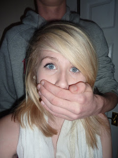
Genre and how the trailer suggests it- I have used the screenshot of a knife with blood dripping of it, this shows genre because all horror films have weapons in them and some blood. I also used this image because it uses the flashing lights effect we used which also hints horror as flashing images are often used to scare the audience and there view of the scene is not clear. Our trailer suggests horror genre because of the use of weapons, blood, running shots and seeing people looking scared, crawling away etc. It finishes on a cliff hanger with a girl getting grabbed and her mouth covered by the killers hand this is very ambiguous which is what teaser trailers should be like, not knowing the outcome of the teaser makes the audience become interested and want to know what happens.


How characters are intoduced- In the teaser trailer the first character that is introduced is the boy when he was younger, at first the audience may feel sympathy for him as he is alone and neglected, this suddenly changes when we see the boy grown up attacking victims from his past. They are introduced by the quick shots, we never see the killers face only the victims reactions, this is very typical of a horror teaser. Some are shown running, looking scared or being attacked, this is how they are introduced but the audience do not know who these people are.


Special Effects- For the special effects I used the picture of when one of the victims is laying down, we do not know what has happened to this victim. The only special effect we used was the flashing images we created with a torch that flickers. This effect is commonly used in horror teaser trailer which makes ours very realistic and typical for the horror genre. We used this effect to create a eerie atmosphere that gives the audience a misjudged view of the shot.


Magazine Front Cover Evaluation:


Poster Evaluation:


Wednesday, 30 March 2011

Time Management- Progress Diary

We have completed making the teaser poster and the magazine front cover for our project. We have finished all areas of construction. The last section that needs to be done is the evaluation, were the whole project is evaluated.

Tuesday, 29 March 2011

Ancillary Task 2 - Magazine Front Cover

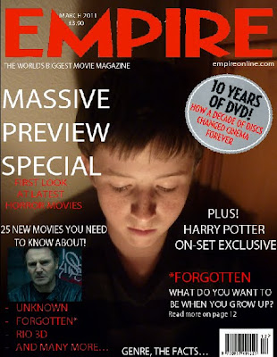
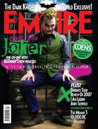
This is the Magazine front cover we have made for our film, we chose Empire to be the magazine we will use because it looks really proffessional and we thought it would suit the idea we had for our magazine. I used the layout Empire Magazine uses and the font it uses. I added the title massive preview special to hint at this magazine issue will be about teaser trailers and films that will be future releases. We used elements from the real magazine to make it more realistic.


This is the magazine front cover that inspired our own magazine cover.


This is my second version of the magazine front cover.
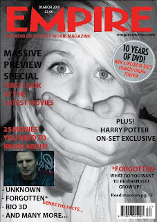
This is the original image we started of with before manipulating it on Photoshop to use for the magazine front cover.


Monday, 28 March 2011

Ancillary Task 1- Teaser Poster

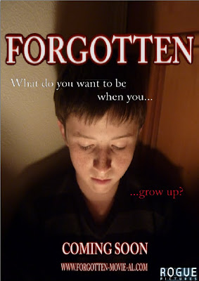
This is the teaser poster we have created for our teaser trailer Forgotten. We have used the main character from our teaser trailer but we have used this character when he was younger. We have shown him looking down which hints to the audience that he is sad, we have also manipulated this photo using Adobe Photoshop to create a contrasted effect, and have his face covered in light but the background mainly darkness. We have made the title the main focus of the poster so it really stands out and closely underneath it we have included our tag line " What do you want to be when you... ...grow up?" We have also included the institution to make it more realistic and show the genre of the film, we then included the coming soon sign which many teaser posters use. We have then also included the website which people who want to see the film go on to create hype for the movie. We have a colour scheme for a teaser trailer and poster which is black and red, we have also used the same font we used for the teaser trailer to show a connection.

Thursday, 24 March 2011

Poster Images

Here are a range of photos we have taken that we may use for our poster and magazine front cover. We took quite afew photos from different angles so we had more choice of what to use. We may use the image of the victim to hint at the horror genre or we may use the image of the boy when he was younger to show relevance to the story.


Wednesday, 23 March 2011

Final Film

This is the Final cut for our Teaser Trailer Forgotten.

Tuesday, 8 March 2011

Time Management- Progress Diary

We have finished filming all our scenes we would like to add to our teaser trailer and have started editing, we have also been practicing making posters using Adobe Photoshop and Adobe Illustrator. Editing will be quite a long process as we have many shots that need to be added and we have extra footage which is not needed.